Rumination
Some viewers of the blog will, by now, have caught on to my predilection for Black & White images...
...sometimes being a stubborn S.O.B. gets me stuck in places I don't want to be...
Early last year I found myself staying with friends up in the Sierra and this led to dawn photography at a place called Convict Lake. I had had a mental image the photo I wanted for for ever. Granted the picture I wanted was a total photographic cliche, right along with "The Road Goes on Forever", but sometimes there is satisfaction to be had from pulling off a well executed cliche.
Naturally the image I had imagined was Black & White!
I fought that B & W picture for weeks in post production (that's fancy language for trying to get a print I was happy with) and failed.
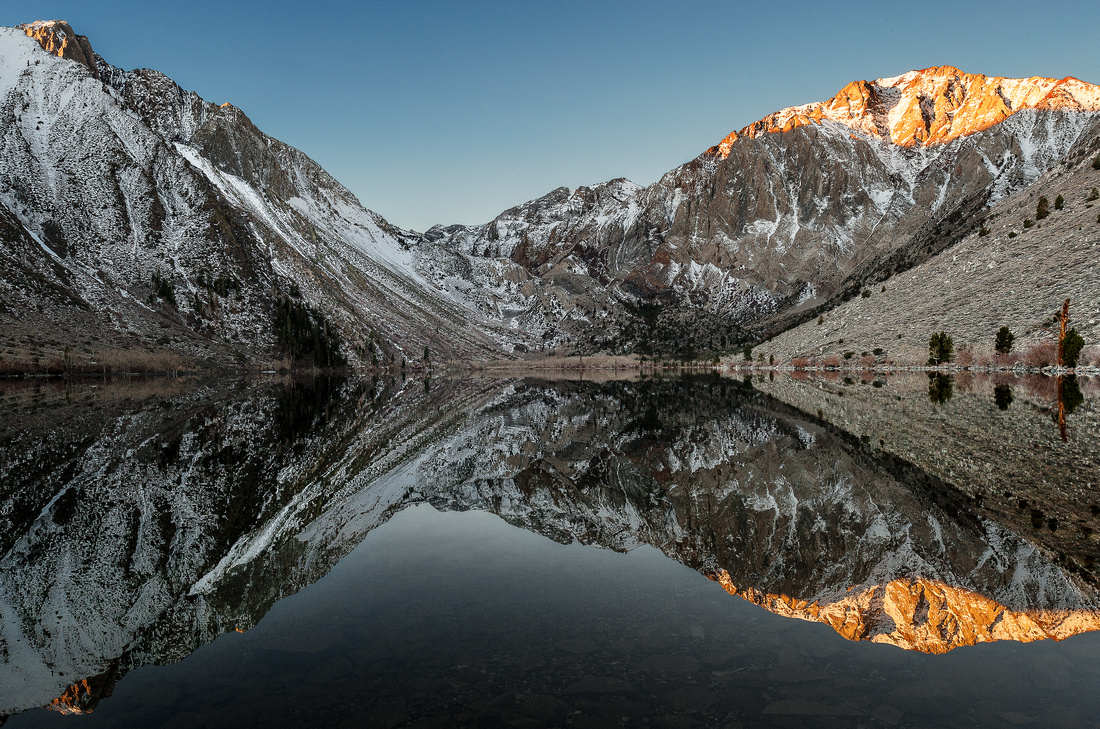
Nearly a year later I went back at it and, bowing to the facts (never easy) tried a couple of versions in color...I'll let you be the judges...
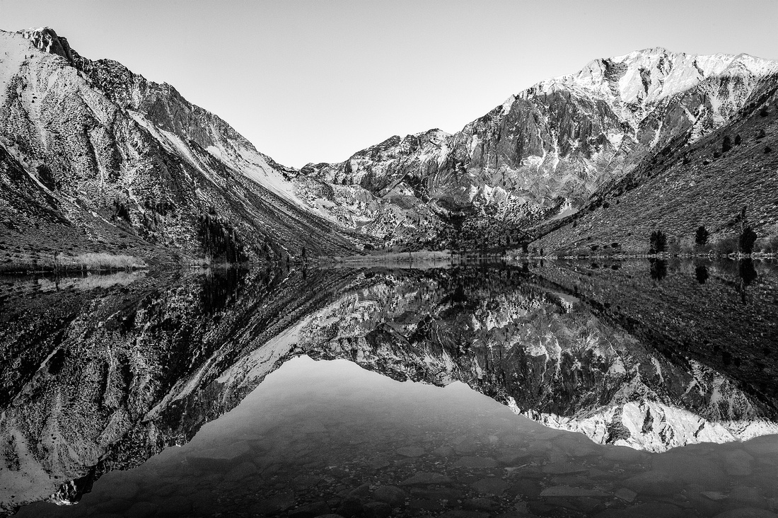

Here is the Black and White version, lot's of detail, there is real white and a full-on black to to be had, nicely enough composed, and the photographer gets extra points for getting up at oh-dark-thirty and freezing his proverbial off in the pursuit of his passion.
But BORING!!!!!!!!!!!!!!!!!!!!!!!!!!!!!!!!!
Color version #1. Slightly less detail in the water foreground, same composition, same frozen photographer's whatsit, but that first early light (in color) gives the thing a bit more interest...
Still, pretty boring...

About twenty minutes later, the sun is further up and the sky has become a big blue dome, filling the shadows with that color.
Fair enough, this is the way cameras see things, not the way humans do. To most people's eye the blue shadows are too much and don't look "real". Our minds filter out the excess blue in real life and we don't expect it in an image.
For me though this is a really satisfying picture at last.
The big graphic elements (two arrows coming towards the center) are emphasized by the color (contrasting warm on the right, cold on the left). The size of the sunlit piece of mountain and it's reflection are balanced and the dark blue foreground helps lead a viewer into the image, instead of tripping him (ok: her/him/it; you know what I meant!) up in the rocks under the water...
Probably the wordiest blog post I've ever put out, so thanks for your patience.
Last, but not least, Happy New Year from a delightfully rainy Pasadena.
|
January
February
March
April
May
June
July
August
September
(2)
October (2)
(4)
November (4)
(3)
December (3)
|
(2)
January (2)
February
(1)
March (1)
(3)
April (3)
(3)
May (3)
(4)
June (4)
(2)
July (2)
(2)
August (2)
(3)
September (3)
(2)
October (2)
(3)
November (3)
(2)
December (2)
|
(1)
January (1)
(3)
February (3)
(3)
March (3)
(2)
April (2)
(1)
May (1)
June
(1)
July (1)
(3)
August (3)
(2)
September (2)
(1)
October (1)
(5)
November (5)
(5)
December (5)
|
(1)
January (1)
(1)
February (1)
(3)
March (3)
(1)
April (1)
(1)
May (1)
(2)
June (2)
(1)
July (1)
August
(2)
September (2)
October
(3)
November (3)
(2)
December (2)
|
(1)
January (1)
(1)
February (1)
March
(5)
April (5)
(3)
May (3)
(3)
June (3)
(1)
July (1)
(1)
August (1)
(2)
September (2)
(1)
October (1)
(1)
November (1)
(2)
December (2)
|
(1)
January (1)
(4)
February (4)
(1)
March (1)
(2)
April (2)
(1)
May (1)
(3)
June (3)
July
August
September
(2)
October (2)
(2)
November (2)
(1)
December (1)
|
January
(1)
February (1)
(4)
March (4)
(2)
April (2)
(4)
May (4)
June
July
August
(5)
September (5)
(3)
October (3)
(2)
November (2)
(3)
December (3)
|
January
(3)
February (3)
(1)
March (1)
(1)
April (1)
(1)
May (1)
(1)
June (1)
(1)
July (1)
August
September
October
November
(1)
December (1)
|
January
February
(3)
March (3)
(4)
April (4)
(3)
May (3)
(1)
June (1)
July
August
(2)
September (2)
(2)
October (2)
November
(2)
December (2)
|
January
February
March
(1)
April (1)
(2)
May (2)
(1)
June (1)
July
(1)
August (1)
(1)
September (1)
(1)
October (1)
November
December
|
(1)
January (1)
February
March
April
May
(2)
June (2)
July
(3)
August (3)
September
October
November
December
|
(1)
January (1)
February
March
April
May
June
July
August
September
October
(1)
November (1)
December
|
January
February
March
April
May
June
July
(1)
August (1)
(2)
September (2)
(1)
October (1)
November
December
|
January
February
March
April
May
June
July
August
September
October
November
December
|